Ohad ben-Shahar

Original visual demos that make a point


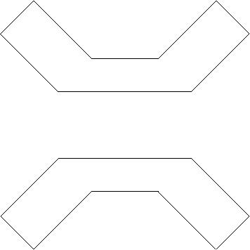
Social conformity of a line : First coined by Kanizsa (1979), social conformity of a line refers to the tendency of locally parallel lines to group together into inseperatable wholes (indeed, social groups) in which each line looses its individual identity. Strangly, the more appealing examples that Kanizsa used to illustrate social conformity of a line were proposed much eariler (Galli and Zama 1931) while his own original demo (the vanishing church) was rather odd. Here are few novel examples of the same phenomenon...

This image clearly conveys two polygons. The addition of few parallel lines dramatically changes the interpretation of the scene to a texture diamond occluding a cross.


The next image contains a well known and familiar object. Can you spot it? Again, social confirmity of a line takes effect in making this object barely seen. The same object pops out as soon as it becomes a distinct social group from the ground.


Internal representation of texture flows: This image shows an object completed amodally behind few occluders. In particularly, the perception is of a single object covered by a single, uniform, and coherent texture flow. It requires a great deal of scrutiny to realize that each of its unoccluded segments contains a different number of lines, which precludes the completion of the gaps by a line-by-line process. Demonstrations like this serve as an argument that the internal representation of texture flows must be dense.


Orientation-based segmentation: Is is only due to the orientation contrast?: In the orientaion-based segmentation literature, it has been commonly assumed that segmentation is dominated by the orientation contrast (or gradient) that defines the visual edge. More detailed studied links the segmentation to the relationship between two orientation constrasts, one within regions and another between them. Much of the research into this issue was done by Nothdurft, who also devised the following stimulus, now sometimes dubbed the "Nothdurft square". It is a nice demonstration that for salient edges the ratio between the two orientation contrasts must be significantly larger than 1. Note that the orientation contrast is constant along the square's edges (90 degrees in this case).

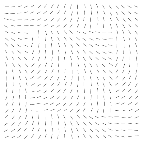
One features of this figure is that it pushes segmentation performance to its ceiling. A much more intriguing observation is made by lowering the contrast ratio. Now, while segmentation is much more difficult (as expected from existing models), it is also evident that the saliency of the orientation edges varies significantly, despite the fact that the orientation contrast is still constant across the square's edges. This suggests that the two orientation contrasts are not the only determinant factor in orientaion-based segmentation. An much more radical demonstration is made by changing the direction of the orientaiton gradient within the figure and the ground. Now, despite the fact the orientation contrast is still constant along the square's edges (all 4 of them), two of them virtually disappear. Here is a complimentary example with the top and bottom edges virtually vanishing. Finally, here is another example of a Nothdurft square with constant orientation gradient both within regions and between them, where the saliency of the perceptual edges is anything but constant. Note in particular how the top edge is much more salient than the bottom one.


Original Nothdurft Square with high ratio of the between/within gradients Square with smaller ratio of the between/within gradients Square with top/bottom edges more salient Square with left/right edges more salient Square with top edge more salient than bottom one


Last updated: August 19, 2002